Sunday, May 30, 2010

The Trouble with Summer

Ack! I missed posting last week. My apologies. It might have something to do with the fact that though I am out of school, my life is a whirlwind of too much to do.

This summer I am in the process of realizing 3.5 designs and working on another. I was hired to design costumes and scenery for two upcoming shows in the Cabaret space at Triad Stage in conjunction with UNCG's Theatre 232. The two pieces, The Actor's Nightmare and Sister Mary Ignatius Explains it All to You are performing back to back, which is why the design is 3.5 rather than 4. The set is essentially the same for both, with a few details changed. But the costumes, boy-howdy (as my mother likes to say). They are proving difficult and a pain.

But really, what overwhelms me is having to wear two different hats at the same time. I don't know how those European designers do it. Well, I have my theories (assistants!) but even still, my brain seems so jumbled with all of my lists of things to do. And then, as I said, I'm in design meetings for a completely different production, Oklahoma!, which will open UNCG's 2010-11 season. The professors here have said on a number of occasions how overlapping designs is not out of the ordinary, but I wonder about this process.

I'd also like to state for the record that summer work is bullocks. I do not understand why the theatre shuts down for the summer, and we all scramble for summer-stock jobs where we get paid infinitely too little for a jam-packed, insanity-inducing process that spans 2 months. Was this kind of season created to follow the agrarian calendar (like schools) or to give us time off because we're ever so burnt out (sarcasm)? I commend theatres like Triad Stage, mentioned above, that still close down in the summer, but not for as long. Currently they are wrapping up their season with a new work by artistic director Preston Lane called Providence Gap. It wraps up July 4th weekend and then rehearsals, etc restart in August for The Glass Menagerie. Somehow that makes a little more sense to me than taking May to August off. But to each theatre their own.

Nevertheless, my summer job is plugging away and Oklahoma! is shaping up nicely (perhaps scans of my designs will hop up here as soon as they are [mostly] finalized). Personally, though I like time off in the summer, I'd rather a little more stability in the job market and a little less stress about getting to my September pay check.
Sunday, May 16, 2010

Boy Toys and Girl Toys

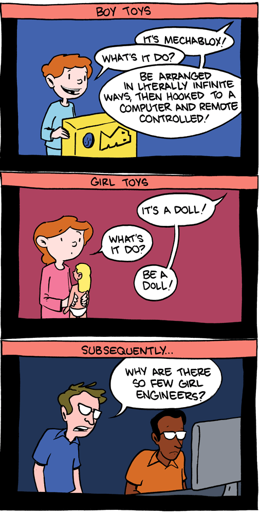
This week's blog post is inspired by today's webcomic from Saturday Morning Breakfast Cereal:


Funny and oh-so true.

This got me thinking about the gender divide in theatre and how this could easily be a comic that questions why there are not more female scenic designers. Though changing, young girls are more likely to be exposed to toys that promote girly things, like mothering or fashion-sense. Meanwhile, boys get toys that nurture imagination and, well, engineering.

Personally, I had Barbies and Legos at my fingertips as a young girl. But where I think it makes a world of difference is that I was also exposed to boy things. None of my parents (I have three-- mom, dad, step-mom) ever told me that there were certain things that I could not do because I was girl (like help with building stuff or run around outside making mud pies). Recently I had a discussion with a male friend of mine about playing dress up. He assumed that I had been the typical tom-boy with no interest in girly things like playing princess and wearing pretty clothes. That is incorrect. I loved to play dress up and there are many pictures of me sitting with my flannel nightgown swirled out around me combing the hair of my Barbies and My Little Ponies. Nevertheless, I also knew that on a daily basis I'd much prefer to wear pants so that I could run and jump and climb. I'd say that I viewed the world as an equal-opportunity place.

And then I really started to delve into theatre (and hit puberty) and it became obvious that if I wanted to be the girl who didn't work on costumes I needed to either stick to the painting and props, or I needed to be more butch. I did both, but really embraced my inner tom-boy and set aside all notions of girliness in favor of being "one of the guys." This has continued to this day, bleeding into my friendships and relationships. I have not been considered someone who wears a dress willingly by anybody for the last five years. And I do believe this has a lot to do with my desire to be accepted by the guys in the shop as their equal. Removing the gender markers that clothing provides, I strive to prove my worth as a scenic designer by denying my gender.

Not anymore.

This year I vowed to care more about my appearance and buy clothing because I liked it, which often means because I think it is pretty. This means I now own dresses and skirts and high heels. And the first day that I wore a dress to class this semester, even my professor (who is male) commented on it. And while I can't really wear these clothes in the shop anyway (not just because of safety, I mean, I don't want to have an entire wardrobe of paint clothes), I feel like I have been able to embrace a part of me that has lain dormant because I felt that my gender was a problem. I am going to be the tom-boy and also enjoy wearing frilly dresses. There is a time and place for both and they are not mutually exclusive.

So, I say, give your daughters Legos and Barbies. And your sons too. Allow them to help Dad fix the sink and Mom bake pies. Demonstrate that it is about what you enjoy doing, not what you're supposed to do because of your chromosomes. The world should be equal for all. Sure, it isn't and children will pick up on it, but who knows what kind of ideas might come if they can not only pick out Barbie's prom dress but also design the venue as well.

Wednesday, May 12, 2010

Fin: 2 Years Down, 1 to Go


So, I am finally done with year two of my three year MFA as of about 10:30 am this morning, which is why I didn't post last Sunday, as usual. The end of the year has given me a number of things to muse over, but one specifically is the review and portfolio process.

Here at UNCG, the graduate designers attend a 30 minute review at the end of each semester. Until this last one, we generally just brought show and sketchbooks to demonstrate the completed work in and outside the classroom. Due to my own interests in catching up on my physical portfolio and the two graduating designers having (mostly) completed their portfolios for work, this year we just brought portfolios. I must say that I prefer the portfolio review rather than show books, etc.

While the portfolio review forces me to keep my work current in the book (rather than waiting 3 years to update it) and keeps me from having to lug around stacks of 3-inch binders, it is more helpful to look at the distilled work overall. I also feel that the professors can better respond to the work in a final portfolio presentation and see how we, as young designers, are going to present ourselves to the world at large in job applications. At my undergrad we did a portfolio review that was set up a lot like the tables at U/RTAs (or so I've been told) so that, though we included things like show books and full-size drafting, it was set up in a way to depict the life of our work. I believe portfolios are a better indication of the growth of a student/designer and force us to really choose wisely what we include in the portfolio.

I also feel that the portfolio allows for more discussion to occur about the things that happen outside of the design classroom. Though it did not happen in my review specifically, I felt that knowing that only my portfolio-quality work would be on the table, the opportunity to ask about the other work I had completed this semester would present itself. Unfortunately, reviews are not really conducive to bringing in a binder full of writings and plays from an academic class, but being succinct with the visual representation of ones design work allows time for conversations about the non-visual work. (Again, that didn't really happen in my review, but such is the nature of conversation.)

And now that the portfolio is updated about 90% from where it was 3 years ago when I started thinking about graduate school, and my exams are all done, I am excited in looking forward to my final year. Many people wonder about why an MFA takes three years, but as it is a terminal degree and studio-based discipline, such is life. But I also feel that, if structured smartly, the third year provides for the culmination of all of the in-class work. I am only taking 1 class each semester and the rest of my credit hours are for the designs I am completing for the department. I am excited to be able to truly focus my brain power on doing what I want to do with my life. And if I ended my academic career here at the 2 year mark (because, let's be honest, I could have crammed more credits into the last 2 years) I wouldn't have the amount of designs to show, but also I wouldn't feel like the time had truly come to an end. Academically, I feel solid, so a Masters of Arts (MA) would be fine, but to truly feel like a Master of Fine Arts, now the finer-detail work will begin.

Sunday, May 2, 2010

Design Portfolio Madness


It is that time of year again in which I struggle to motivate myself to put together my physical portfolio. For those of you who haven't gone clicking excitedly, I have an online portfolio of both my theatre and photography work. It is so nice in this day and age of digital output, to just throw it up online and send off a link. However, physical portfolios do come in handy, as I have seen recently as a colleague prepares to go to a job interview at a school in New York.

However, I am left to wonder a few things about portfolios in general at this juncture.

1. How different is the digital portfolio to a physical book?

I have heard on more than one occasion that they differ quite a lot, and I understand that because the constraints on one are not the same with the other. However, other than size, scanning, and printing issues, why would you include completely different things in one or the other? My current physical portfolio has less stuff than the one online, but all of my shows have pages, I just don't keep them in the portfolio depending on what I am presenting.

2. How big of a portfolio book should I use?

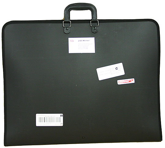
In undergrad, my mentor insisted that I get a portfolio big enough to hold my drafting. So I now have an 18x24 portfolio that is a bit of a monster to lug around but gives me lots of space to lay out sketches, pictures, etc. But last year I purchased an 11x17 book in order to accommodate what the professors here at UNCG have me produce. The problem is that I can't fit enough information on just two pages of an 11x17 and some of my shows span 3 or 4 sets of pages. I know that there are in between sizes I could get, but I don't really need any more portfolio books. Really. I have decided for my review this year to repopulate my big book with pages since I have been ignoring it and I do prefer how much space I have comparatively.

3. How do I organize the book?

I see this question the most often from young designers who are working on books and the variations are endless. I have always been a fan of chronological organization of shows/projects because I feel that (1) it shows your development and (2) it matches your resume (in a sense since I advocate for starting with your earliest work). However, if you have different kinds of design work in one book like costumes and scenery or scenery and lighting, it's sometimes best to break them apart and group them together. (And don't even get me started on how to include extra work, like scene painting samples and sketches). The part of my brain that is OCD really would just like to stick with chronological ordering so that I know it makes sense, but the suggestion to lead with your best foot is always a good idea. Again, this is why electronic portfolios are nice because the information can be organized, but the order in which it is viewed always differs so reorganization for different applications does not get in your way.


These questions are just your basic meaning-of-life questions, and completely ignore the biggest pain experienced when preparing a physical portfolio: the leaching of your money for printing all of the stuff that has to be done. Yuck! Nevertheless, in the interim of generations and digital media availability, the physical portfolio is a beast to be tamed. Excuse me while I go get my whips and chain.