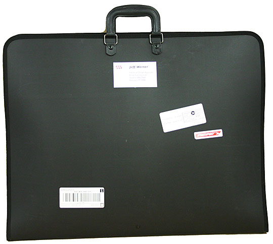
It is that time of year again in which I struggle to motivate myself to put together my physical portfolio. For those of you who haven't gone clicking excitedly, I have an online portfolio of both my theatre and photography work. It is so nice in this day and age of digital output, to just throw it up online and send off a link. However, physical portfolios do come in handy, as I have seen recently as a colleague prepares to go to a job interview at a school in New York.
However, I am left to wonder a few things about portfolios in general at this juncture.
1. How different is the digital portfolio to a physical book?
I have heard on more than one occasion that they differ quite a lot, and I understand that because the constraints on one are not the same with the other. However, other than size, scanning, and printing issues, why would you include completely different things in one or the other? My current physical portfolio has less stuff than the one online, but all of my shows have pages, I just don't keep them in the portfolio depending on what I am presenting.
2. How big of a portfolio book should I use?
In undergrad, my mentor insisted that I get a portfolio big enough to hold my drafting. So I now have an 18x24 portfolio that is a bit of a monster to lug around but gives me lots of space to lay out sketches, pictures, etc. But last year I purchased an 11x17 book in order to accommodate what the professors here at UNCG have me produce. The problem is that I can't fit enough information on just two pages of an 11x17 and some of my shows span 3 or 4 sets of pages. I know that there are in between sizes I could get, but I don't really need any more portfolio books. Really. I have decided for my review this year to repopulate my big book with pages since I have been ignoring it and I do prefer how much space I have comparatively.
3. How do I organize the book?
I see this question the most often from young designers who are working on books and the variations are endless. I have always been a fan of chronological organization of shows/projects because I feel that (1) it shows your development and (2) it matches your resume (in a sense since I advocate for starting with your earliest work). However, if you have different kinds of design work in one book like costumes and scenery or scenery and lighting, it's sometimes best to break them apart and group them together. (And don't even get me started on how to include extra work, like scene painting samples and sketches). The part of my brain that is OCD really would just like to stick with chronological ordering so that I know it makes sense, but the suggestion to lead with your best foot is always a good idea. Again, this is why electronic portfolios are nice because the information can be organized, but the order in which it is viewed always differs so reorganization for different applications does not get in your way.
These questions are just your basic meaning-of-life questions, and completely ignore the biggest pain experienced when preparing a physical portfolio: the leaching of your money for printing all of the stuff that has to be done. Yuck! Nevertheless, in the interim of generations and digital media availability, the physical portfolio is a beast to be tamed. Excuse me while I go get my whips and chain.
No comments:
Post a Comment