Showing posts with label portfolio. Show all posts

Sunday, July 11, 2010

Theatrical Photography


When I seriously began working on my theatrical career at Grinnell, I also discovered a secret love of capturing theatre on stage with my camera. I was also working as a staff photographer for the campus newspaper, The Scarlet & Black, and volunteered to sit through dress rehearsals and shoot the pictures because I already knew the directors, actors, and stage managers that I would need to ask permission of.

Sitting in the darkened theatre while the final pieces are coming together is a magical time. My theatrical brain was often enthralled and had to be turned off so that I would focus through the lens at the action on stage. Ultimately, I enjoyed that with little effort or input by myself, the visual impact of my subject was heightened and dramatic. By definition, a theatrical moment has dramatic lighting and tension that can be perfect to capture in a photograph, like the one below:


Unfortunately, being in the right part of the house and approximate distance from the stage are also important to capturing the right moments, which is why most theatre companies choose to hold separate photo calls so that the photographer(s) can be anywhere they want without interfering with the action of a rehearsal or performance. I, however, prefer to get my pictures during dress and previews because a staged moment does not have the same vitality as capturing the actors mid-gesture with the click of the shutter.


Furthermore, taking pictures during a dress can also provide information that can lead to important decisions during a photo call. The picture at the top of this post, from Jim Wren & Joe Sturgeon's memorable The Revenger's Tragedy at UNCG in the Fall of 2008, was shot during final dress and became the number one sought after pose for photo call for lighting and costumes. It was a stunning scene visually, but without having captured it with my camera, it didn't necessarily read as a defining still-image of the show.

One of the main reasons that I have taken pictures in the theatre is for my personal portfolio as a designer. I find that my photographic training has served me well in that I am also looking for composition of the image that will represent the show for years to come. Granted, I sometimes forget to snap a wide-angle shot to encompass the entire scenic view, but the close-ups are the ones that really get people interested enough to stop and look over my work. Don't tell me that you aren't intrigued by this picture, even if you can't really see what part I played in this staged moment:


To see more of my theatrical photography, please visit the Theatrics Gallery on my website mrtoomey.com.

Wednesday, May 12, 2010

Fin: 2 Years Down, 1 to Go


So, I am finally done with year two of my three year MFA as of about 10:30 am this morning, which is why I didn't post last Sunday, as usual. The end of the year has given me a number of things to muse over, but one specifically is the review and portfolio process.

Here at UNCG, the graduate designers attend a 30 minute review at the end of each semester. Until this last one, we generally just brought show and sketchbooks to demonstrate the completed work in and outside the classroom. Due to my own interests in catching up on my physical portfolio and the two graduating designers having (mostly) completed their portfolios for work, this year we just brought portfolios. I must say that I prefer the portfolio review rather than show books, etc.

While the portfolio review forces me to keep my work current in the book (rather than waiting 3 years to update it) and keeps me from having to lug around stacks of 3-inch binders, it is more helpful to look at the distilled work overall. I also feel that the professors can better respond to the work in a final portfolio presentation and see how we, as young designers, are going to present ourselves to the world at large in job applications. At my undergrad we did a portfolio review that was set up a lot like the tables at U/RTAs (or so I've been told) so that, though we included things like show books and full-size drafting, it was set up in a way to depict the life of our work. I believe portfolios are a better indication of the growth of a student/designer and force us to really choose wisely what we include in the portfolio.

I also feel that the portfolio allows for more discussion to occur about the things that happen outside of the design classroom. Though it did not happen in my review specifically, I felt that knowing that only my portfolio-quality work would be on the table, the opportunity to ask about the other work I had completed this semester would present itself. Unfortunately, reviews are not really conducive to bringing in a binder full of writings and plays from an academic class, but being succinct with the visual representation of ones design work allows time for conversations about the non-visual work. (Again, that didn't really happen in my review, but such is the nature of conversation.)

And now that the portfolio is updated about 90% from where it was 3 years ago when I started thinking about graduate school, and my exams are all done, I am excited in looking forward to my final year. Many people wonder about why an MFA takes three years, but as it is a terminal degree and studio-based discipline, such is life. But I also feel that, if structured smartly, the third year provides for the culmination of all of the in-class work. I am only taking 1 class each semester and the rest of my credit hours are for the designs I am completing for the department. I am excited to be able to truly focus my brain power on doing what I want to do with my life. And if I ended my academic career here at the 2 year mark (because, let's be honest, I could have crammed more credits into the last 2 years) I wouldn't have the amount of designs to show, but also I wouldn't feel like the time had truly come to an end. Academically, I feel solid, so a Masters of Arts (MA) would be fine, but to truly feel like a Master of Fine Arts, now the finer-detail work will begin.

Sunday, May 2, 2010

Design Portfolio Madness


It is that time of year again in which I struggle to motivate myself to put together my physical portfolio. For those of you who haven't gone clicking excitedly, I have an online portfolio of both my theatre and photography work. It is so nice in this day and age of digital output, to just throw it up online and send off a link. However, physical portfolios do come in handy, as I have seen recently as a colleague prepares to go to a job interview at a school in New York.

However, I am left to wonder a few things about portfolios in general at this juncture.

1. How different is the digital portfolio to a physical book?

I have heard on more than one occasion that they differ quite a lot, and I understand that because the constraints on one are not the same with the other. However, other than size, scanning, and printing issues, why would you include completely different things in one or the other? My current physical portfolio has less stuff than the one online, but all of my shows have pages, I just don't keep them in the portfolio depending on what I am presenting.

2. How big of a portfolio book should I use?

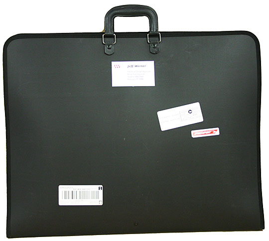
In undergrad, my mentor insisted that I get a portfolio big enough to hold my drafting. So I now have an 18x24 portfolio that is a bit of a monster to lug around but gives me lots of space to lay out sketches, pictures, etc. But last year I purchased an 11x17 book in order to accommodate what the professors here at UNCG have me produce. The problem is that I can't fit enough information on just two pages of an 11x17 and some of my shows span 3 or 4 sets of pages. I know that there are in between sizes I could get, but I don't really need any more portfolio books. Really. I have decided for my review this year to repopulate my big book with pages since I have been ignoring it and I do prefer how much space I have comparatively.

3. How do I organize the book?

I see this question the most often from young designers who are working on books and the variations are endless. I have always been a fan of chronological organization of shows/projects because I feel that (1) it shows your development and (2) it matches your resume (in a sense since I advocate for starting with your earliest work). However, if you have different kinds of design work in one book like costumes and scenery or scenery and lighting, it's sometimes best to break them apart and group them together. (And don't even get me started on how to include extra work, like scene painting samples and sketches). The part of my brain that is OCD really would just like to stick with chronological ordering so that I know it makes sense, but the suggestion to lead with your best foot is always a good idea. Again, this is why electronic portfolios are nice because the information can be organized, but the order in which it is viewed always differs so reorganization for different applications does not get in your way.


These questions are just your basic meaning-of-life questions, and completely ignore the biggest pain experienced when preparing a physical portfolio: the leaching of your money for printing all of the stuff that has to be done. Yuck! Nevertheless, in the interim of generations and digital media availability, the physical portfolio is a beast to be tamed. Excuse me while I go get my whips and chain.